Cart & Popup Cart Redesign
earthboundtrading.com
The increase in mobile traffic and abandoned carts led the eCommerce team to rethink the cart flow from a UX perspective.
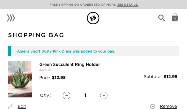
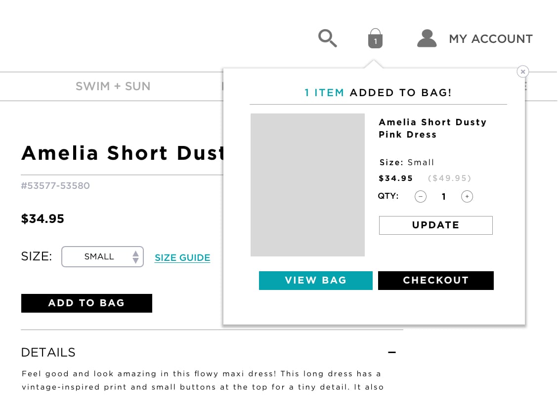
Popup Cart Desktop
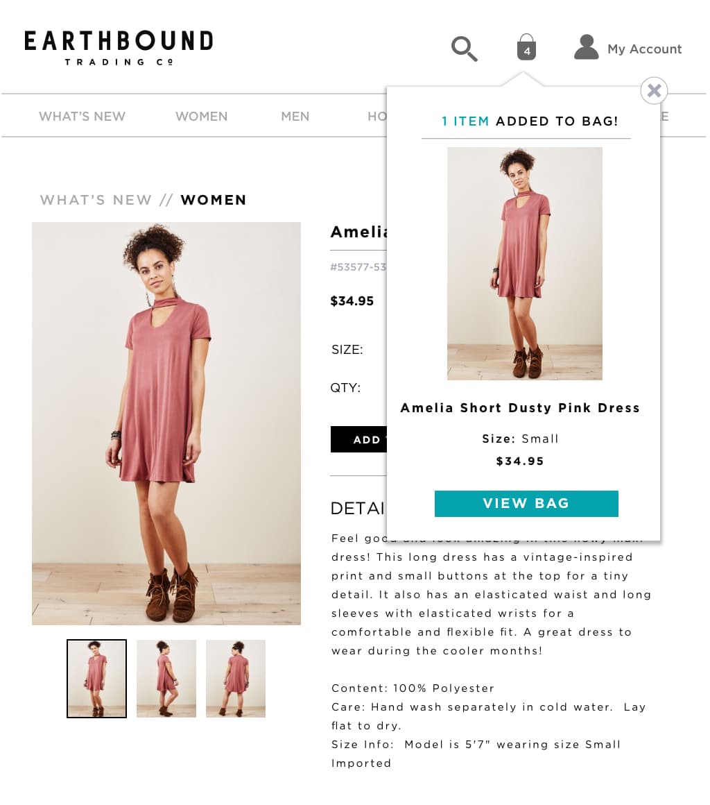
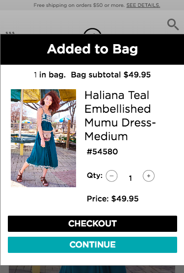
Popup Cart Mobile

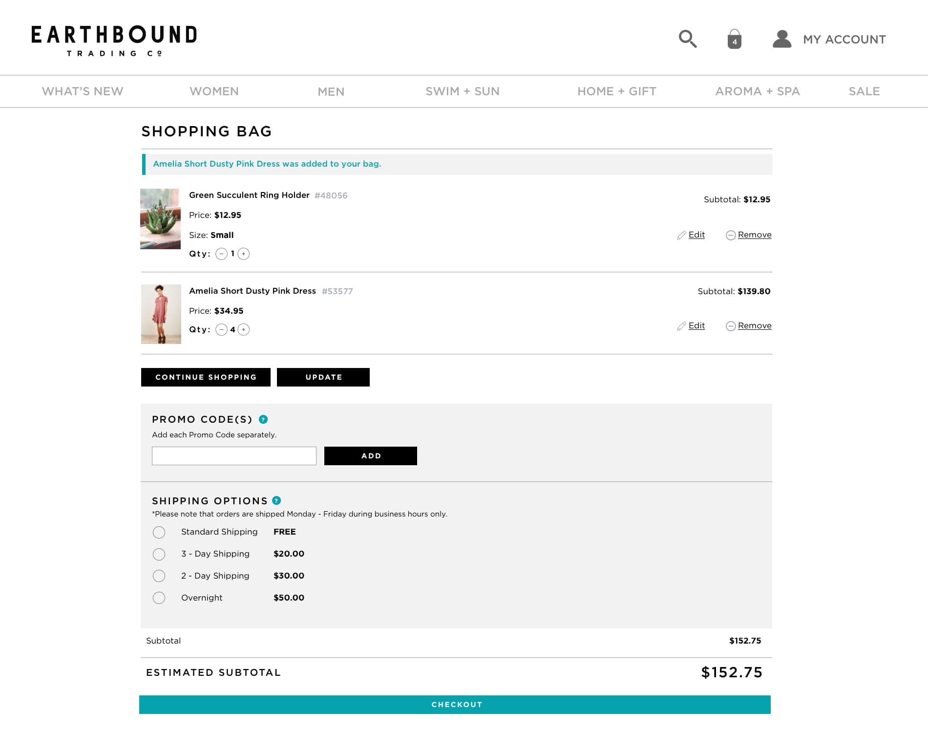
Cart Page Desktop
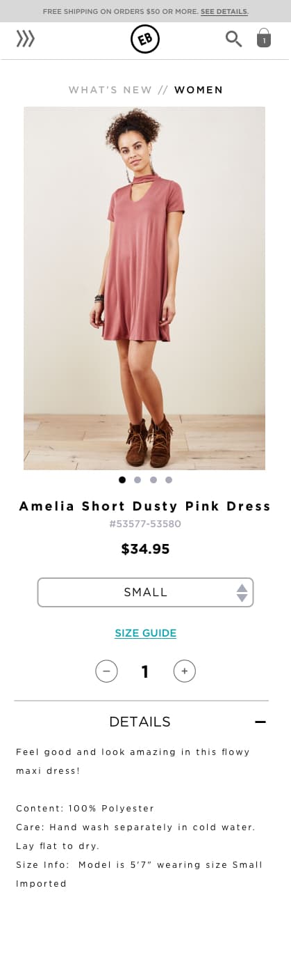
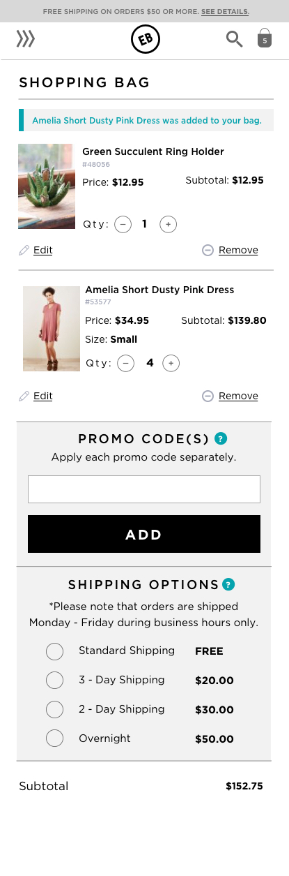
Cart Page Mobile - scroll to see entire page

The challenge
The user problem: Adding product to the cart was a 2-3 step process, and it removed the user's from their shopping flow. Understanding shipping options and troubleshooting promotional codes were confusing to users.
Customer service reported issues, and this was validated by observing screen recordings.
The solution: Popup cart feature and page redesign without a software overhaul.
Research and discovery
Role: Stakeholder interviewer, market researcher, synthesizer.
Methods: Retrospective Probing, screen recordings, google analytics.
Add to cart test insights: Initially, our UX test was geared toward how users navigate our drop-down menu and add products to the cart. In the feedback session, users complained about the way quantity editing functioned.
Users also complained about how "annoying" it was to be taken out of their browsing flow whenever they added a product to their cart.
Making changes to their cart, applying promo codes, and estimating shipping was not part of the test.
When researching how competitors and modern eCommerce websites approach their add-product-to-cart flow, I found they were clean, unassertive, and as short as possible.
Estimate shipping market research: After observing screen recordings and interviewing customer service, developers, and the eCommerce director, I discovered a few required fields on the cart page were unnecessary to display what was essentially table shipping rates. I concluded that users were confused when they applied promo codes because success and error messages were far from the input field.
Popup cart currently on desktop

Popup cart currently on mobile
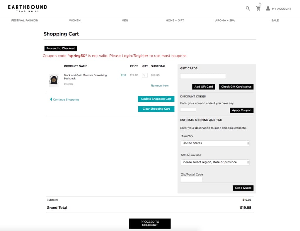
Old desktop cart
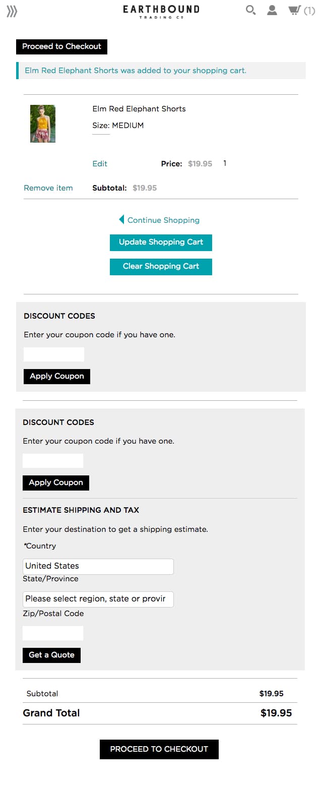
Old mobile cart - scroll to see entire page
Sketching wireframes
Role: Collaborated on wireframing cart and popup page.
Tools: Sketch, InVision.
Popup cart as a summary: We moved the popup cart out of the way and designed it to be summary-like, it didn't make sense to customize the order at this point in the user flow. I suggested we embed them below the sizing configuration to keep actions together.
1 step forward, 3 steps back: The team thought we solved a major annoyance to users, but the truth was the right solution caused a bunch of user issues we couldn't ignore.
Unexpected issues:- Hiding categories
- Taking up too much horizontal space (especially on tablet screens)
- Too many buttons
- Sequence of user actions
- Long titles get scrunched
Desktop original design
Desktop popup cart revised

Limitations to keep in mind: Old school code.
The cart was built on a default template that was inflexible. Tables are not a modern approach, and they can be painfully rigid and unforgiving on mobile.
Gotchas: Initially we thought it would be a good idea to change mobile keyboards on number-only inputs to a dial pad. We thought this would make a real difference and we were proud of our idea until I discovered our shipping rates were flat fees and there was no reason to enter collect user information.
You're fired, "required"-zipcode.

We scrapped the gift card section altogether because it was unnecessary for users to get a subtotal. I designed mobile first because it was the most technically inflexible. I found creative ways to make the content sections responsive without changing most of the HTML.
Once the sections were laid out responsively, I worked with the graphic designer to wireframe the desktop and make branding adjustments.
Sticky mobile buttons: We came up with bottom sticky view bag button on the popup cart, and checkout and update buttons on the cart page.
Mobile - scroll to see entire page

Relocating error messages: I collaborated with the graphic designer to display all messages under the promo code field. I interviewed all admins who create and apply promo code names to understand the potential of how long they could be so I could account for this unpredictable factor.
Error code next to field on mobile

Baby steps
I am currently in development on this project. To keep the project moving forward, we broke it down into two iterations. The first is to brand and style the elements. The second is to implement the removal of the gift card and zip code block. Then I will implement the table shipping rates and error messages.
Teamwork: There are barriers prevent the second implementation from happening. The collaboration of technical work is a dance between myself and our Magento agency. The user stories that are dependent on their input and work are in their court currently.
I have already deployed the first step in the cart and am in the middle of the second.
Learnings
Part of this project requires assistance from Earthbound's agency who are experts on Magento platforms. When it came to Magento specific changes, I learned how small design decisions could sometimes be surprisingly expensive for the effort.
Questioning everything was reinforced to me; just because a tactic is used doesn't mean it's needed.